Pantone Color Matching for Graphic Overlays
What is the Pantone Color Matching System?
The Pantone Color Matching System or PMS is a common industry standard for color reproduction. It is regularly used in graphic overlays design, publishing, and printing companies. Instead of asking for just the color “green”, Pantone can give you the exact shade of green and allow you to communicate that red to others in a standardized, no-nonsense, uncomplicated, communicative way.
Why is the Pantone Color Matching System used?
Pantone Color Matching System is used to help clearly communicate specific and standardized colors and prevent confusion or a problem with manufacturing and printing. It allows special colors to be used and produced from metallics to fluorescents. PMS allows businesses and customers to reference and match colors no matter the media: ink or online. It allows a consistency and uniform base that will not cause a mix up in the final product.
How does PMS Work?
There are several different ways of using PMS, one of which is called the CMYK process which only uses four primary colors: cyan, magenta, yellow and black. You may recognize this as the colors that are used in your printer at home. Guidelines are used to provide the correct cyan, magenta, yellow and black colors – since there are several “versions” and shades. These colors are then mixed in specific amounts to create other colors that are calculated and communicated through the amount of each of the four colors distributes. There are, however, several colors that cannot be created with this process and instead uses 14 colors that are mixed in specific amounts. Pantone colors are given a specific number and that number is then communicated to produce a consistently based color among media.
What kinds of PMS tools are available?
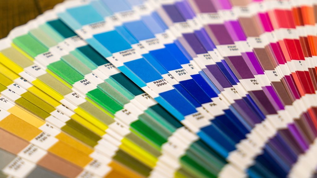
The Pantone Formula guide is a three-guide set of 1,114 solid Pantone specified colors that come in coated, un-coated and matte coated. There are several different books, each for a different industry but each is similar in that it shows the corresponding formula for each color.
There are “chip” books that can be used for quality control. Manufacturers use these chips in order to make sure that the color on the product matches with the chip chosen so that the end product is exactly what the customer asked for. Pantone also provides chips and guides that have colors produced by the four-color process. There are also other color reference guides that include metallics, pastels, tints, duotones, film and foil. There are also online Pantone guides which can be used to reference colors on a computer or design program. Caution should be used when viewing and choosing colors on a computer screen, as each monitor has a different color output, and most are not calibrated for consistency.
What affects the accuracy of PMS?
The three main things that effect the accuracy of PMS is lighting, colors sent via computers and the material of the surface the ink will be printed on. It is best to color match under a controlled daylight viewing for a more accurate reading. In order to make a final decision on the color, it is also a good idea to look at the color under different kinds of light/in different lighting such as natural, fluorescent, UV, and incandescent. This is typically done with a Color Viewing Booth.
Computers may not show you the correct color because each computer screen is different. Your computer may have a higher or lower contrast than that of the customer’s, and most monitors are not calibrated to the same standard output.
Different materials can cause different results when using the same color on them. Each can react differently based on absorption and finish with the colored ink. Some surfaces absorb the ink more than others and will therefore give the color either a glossier or more subdued appearance. Because of this, it is important to note that different finishes on overall products and using the same color, will look different and many times not match well. This can sometimes be controlled by using different coating methods and techniques, however, to get the right look that the customer is looking for. Consideration must be taken towards the materials and finishes being used in combination with all colors of a product.
How is the Pantone Color Matching System used at CSI Keyboards?
There are many other color matching systems out there besides Pantone: Munsell, RAL and Federal Standard Color System. CSI typically uses the Pantone Color Matching System in order to consistently control products for our customers exactly the way they want them. We use it as a common reference to clearly communicate with our customers without the problem of inconsistent colors. As screen printers, CSI finds the Pantone Color Matching System one of the crucial tools we use as it provides us with a standard that our printers can live by and we have found it to be reliable throughout our years of service.


